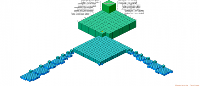
Even in the pre-Panda SEO world faceted navigation was a double-edged sword. Today though, if you let this monster rule your website bad things can happen – on a mass scale. How can webmasters understand how their website architecture truly looks like when they struggle to visualise it?
The above image is a representative slice of a very large product-based website. The visualisation was created using PowerMapper’s Sitemap Generator which was the best application for the job at the time. The illustration above is incomplete and a point at which the software stalled and the crawl was interrupted manually. Why? Because the website architecture lead to infinite combinations due to various facets, browsable filters and tags. Here are a few common factors to mention:
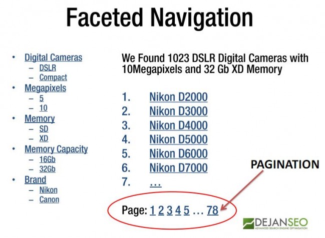
- Canonicalisation (solved with rel canonical)
- Pagination (solved with rel prev and next)
- URL Parameters (solved in Google Webmaster Tools or with rel canonical)
- Browsable Tags (solved with nofollow/noindex)
- Browsable Search Results (solved with nofollow/noindex)
In another attempt we pick a smaller section of the website and let out software run longer to see if the “infinity” theory really holds and it seems to have done so. After hours of scanning we finally give up, producing the following visualisation:
So what can SEO professionals do? Well, there are industrial-strength computation solutions available for big bucks (IBM, Microsoft, Oracle, Fuji Xerox, Siemens…etc) and there are a few firms with clever internal solutions. At SMX Elite in Sydney Dennis Goedegebuure showcased examples of robust-looking custom-built software at eBay (though not strictly related to architecture mapping). For now I would say all hope is lost for visualising and structuring large-scale hyperlink data within a single domain (unless you are Google). Instead what we can focus on are the best practices in terms of keeping website’s structure lean and focused and content as rich and unique as possible.
Sometimes it’s about drawing the line and deciding what is a product and what isn’t:
Look at this fine example of 90’s design Reebok shoes. What defines this product (other than pure awesomeness)?

Primary Properties
Brand: Reebok
Type: Insta Pump
Model: Fury
Without the above you could be looking at any shoe type and not find what you are looking for.
Secondary Properties
Gender: Male
Size: 10
Price: $135
Tertiary Properties
Colour Scheme: “Green” by Tyler Gruwell
Hexalite Air
Graphite
Pump
Reflectors
Question: Is this a different product to the one above?
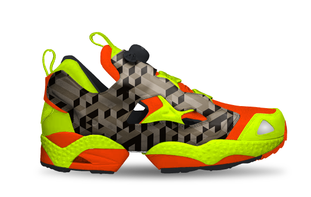
The only difference is the colour scheme “Versuch 2” by Möhring Denis. Well, Reebok seems to think so and they let users submit their own designs, in great numbers. At the time I write this article there are 469 different colour schemes for this one shoe type on Reebok’s website, all user-generated and promoted via social media. The concept is fantastic, but arguably a smaller website could probably not get away with this stunt, not after Panda and not without social signal validation.
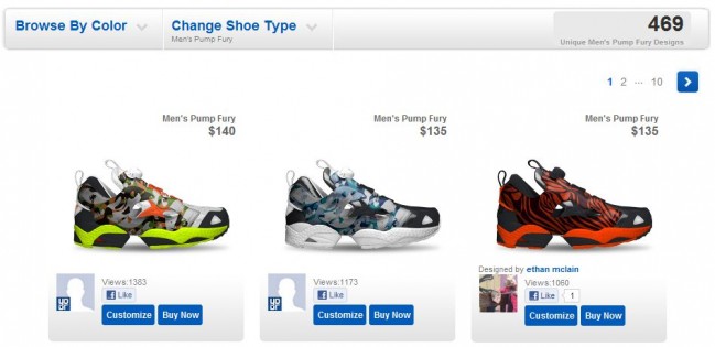
If you take a look at the source of the page you will see that all these shoes are set to both INDEX and FOLLOW. Reebok did one smart thing though, there is no faceted navigation in the mix. If they were to implement that the number of indexable pages would skyrocket from 500 to 5,000,000 and it would be only a matter of time (and PageRank) before those pages are in Google’s index.
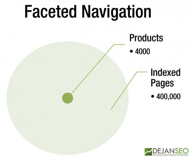
That would surely trip the Panda filter.
Going back to our original product definition dilemma, let’s say it’s safe that a product is defined by its core parameters and surrounded by secondary and tertiary characteristics. Different products (and markets) may require some customisation but in our case it’s quite clear that certain properties should never form a new product.
An example of this would be shoe size. It would be completely silly to create two pages for the above shoe model, one with size 10 and the other with size 12. The available sizes are present on the page and will index and be found for in search.
The Problem
Oh, but it used to work so well. One would create product pages for every possible variation of the product including all non-essential properties such as shoe size. This lead to 10,000,000 page websites and bloat in Google’s index and resulted in a birth of little Panda filter whose job is now to trim the size of the web.
What’s best for the user?
Oh here we go, we’ve heard this phrase so many times from everyone at Google. The truth is that they don’t really know. In last-year’s analysis of eCommerce search queries I found that Google seems to be magnetically attracted to the bottom line pages (e.g. exact product instead of a category). They always strive to give the user “the end result” and minimise the search. Oh, how many times they get it wrong, it’s incredible. This happened so much that it started reminding me of Clippy. Sometimes it’s useful to go over categories, especially in the early research stages – being shoved into a random end-product is not helpful.
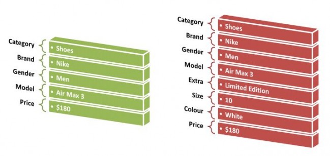
Perhaps the solution is in expanding the old definition of the product:

Into something a bit more elaborate:
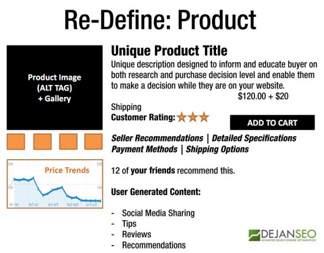
Useful Link: http://schema.org/docs/gs.html
Have you seen any examples of good website architecture and well-defined products? I’d love to see it.
Please comment below.
Dan Petrovic, the managing director of DEJAN, is Australia’s best-known name in the field of search engine optimisation. Dan is a web author, innovator and a highly regarded search industry event speaker.
ORCID iD: https://orcid.org/0000-0002-6886-3211

