It seems, with the development of the internet, and supporting technology in our everyday lives, our time is more and more precious. This is why many of us are so accepting of taking time out of our hectic schedules (even if it is a few minutes) to digest information in the form of an ‘image’ as an expression of data. Data visualisations applications are far reaching, from boardroom presentations, report generation, creative content generation for websites (linkbaits), advertisments and education to name a handful.
Data visualisations are a very effective way to communicate, especially with the rapidly growing social media channels being embraced by more people each day.These visualisations are easily transferable, with the likes of “Like this”, “Share this”,”Tweet this”, “+1” and so forth becoming embedded in our everyday culture, little thought, other than a click of the mouse (and perhaps a comment) is needed to proliferate this content through the internet . Benefits to brands and online marketing in general can be very encouraging. The potential of certain visualisation can indeed, go ‘viral’ and explode a brand from obscurity to cult status almost overnight.
There are many forms and genres of data visualisation, I will try and showcase some of these and some effective tools to assit in generating them below. This is of course just touching on the many different styles – remember, there are entire websites dedicated data visualisation, and new applications and tools are emerging as I type!
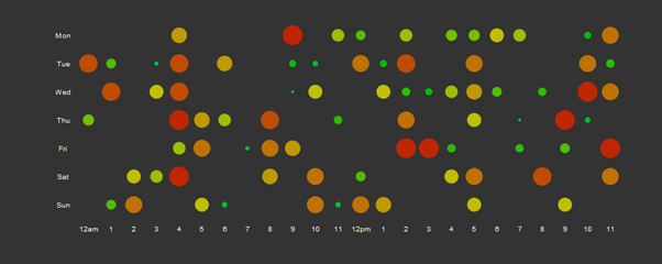
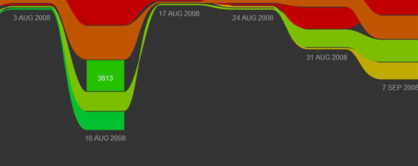
Seen below is an abstract clean approach to data visualisation, often used in reports to showcase a metric over time and or to support numerical data visually.
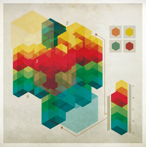
Often a more artistic based approach is employed to stimulate an emotional response in line with brand or task objectives as seen below.
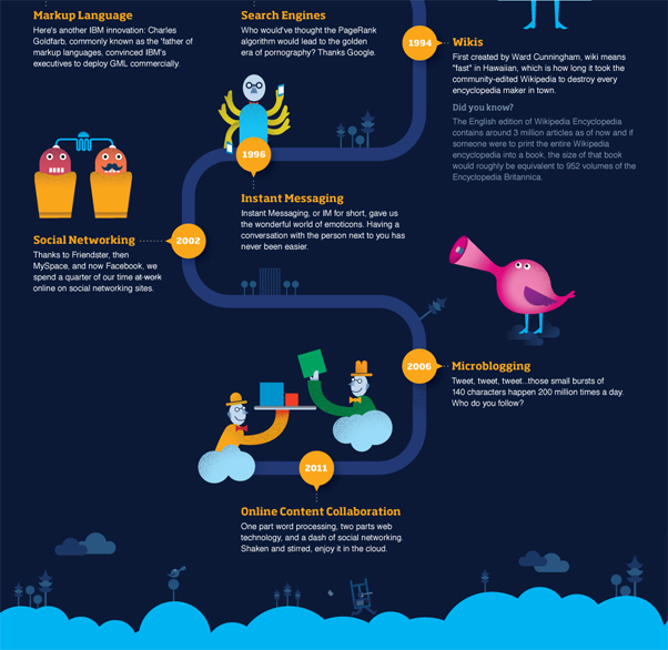
Quirky cartoon based ‘character’ often assist in making information which may be somewhat ‘dry’, be a lot more palatable to most. Seen below is an excerpt from an Atlassian infographic displaying the history of communication.
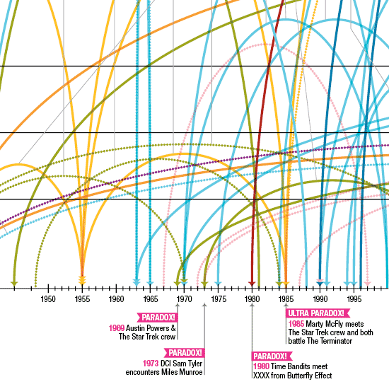
See below some workings detail of a complex manually created visualisation of the links associated with the methods of time travel from TV and film. The end result ends up being quite dynamic, if not a little confusing, this sort of data visualisation often promotes detailed investigation to understand it better. It may however run the risk of losing some if indeed it becomes even more confusing than the original data it is generated from.
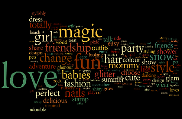
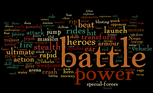
Yet another approach is with the use of text as an image to accentuate importance of a particular focus. Something we can all relate to and a quite widely used form of data visualisation, so much so that this can often be used ineffectively if not supported by real data (as can any of these methods). See the following ‘Most commonly used words in advertisements’ from “The Achilles Effect” showcasing this method.
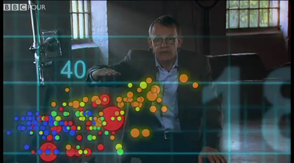
Fully interactive ‘augmented reality’ visualisations such as the following may well become commonplace in our boardrooms. The following movie is from Hans Rosling in conjunction with the BBC Chanel 4 in the UK which is used as a tool to discuss the information more effectively with the viewers.
This piece was titled from ‘The Joy of Stats’ and tells the story of the world in 200 countries over 200 years using 120,000 numbers – in just four minutes. Not only is it a good example of future opportunities for data visualisation, but communicated well how effective they can be as it communicates so well, no doubt thousands of pages and hours or research in the matter of minutes!
Following is a list of great online tools you can use to make your own ‘pretty data’. Some have trials, some are free, some will charge you a licencing fee. But all can have a place in the communication of information effectively.
http://www.amcharts.com/
http://www.excelcharts.com
http://raphaeljs.com/
http://www.fusioncharts.com/
http://www.wondergraphs.com/
http://www.highcharts.com/
Improve your brands identity, make your reports tell a better story, improve you communication for the time poor, or the uninspired – share your data and prosper with the aid of data visualisation!
Dan Petrovic, the managing director of DEJAN, is Australia’s best-known name in the field of search engine optimisation. Dan is a web author, innovator and a highly regarded search industry event speaker.
ORCID iD: https://orcid.org/0000-0002-6886-3211


FusionCharts is a great tool for Data Visualisation. Have been using from last few months, great experience indeed. Thanks.
Can we make a data visualiation using Java codings. if so please let me know what is the need to write the code