Okay, yes! There are loads of blog posts with examples of calls to action out there already, but we’re often asked for good examples, and having looked through some of the existing posts, they don’t do exactly what I want. The aim of this post is to provide a list of examples without too much complication to give designers or SEO’s a quick point of reference and inspiration from some of the best designed calls to action on the interwebs.
If you’re looking for a comprehensive explanation of how various calls to action work, you can’t do much better than this PDF guide by Hub Spot.
Below I’ve divided the calls to action into groups of what I deem their most significant characteristic with a brief explanation of how and why those features are important.
WARNING: You may feel an intense desire to click some of these screenshots.
Prominent Buttons
Buttons so good you just have to click them. Buttons give a sense that something is going to happen and differentiate themselves from other links on the page as special. The following design elements are commonly used to make buttons stand out.
- Additional space around them compared with other elements on the page
- Contrasting colours (Check out the opposites on a colour wheel)
- Design elements such as arrows or a person looking to draw attention to them

The Firefox download button dominates the page whilst additional information and reassurance surrounds it.
The Chrome download button is front and center on the page and stands out clearly.
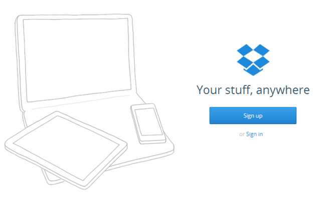
The Dropbox homepage appears almost empty (above the fold) except for the call to action.
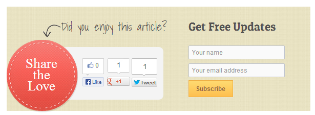
This example of the OptinSkin WordPress plugin draws attention to the social buttons.
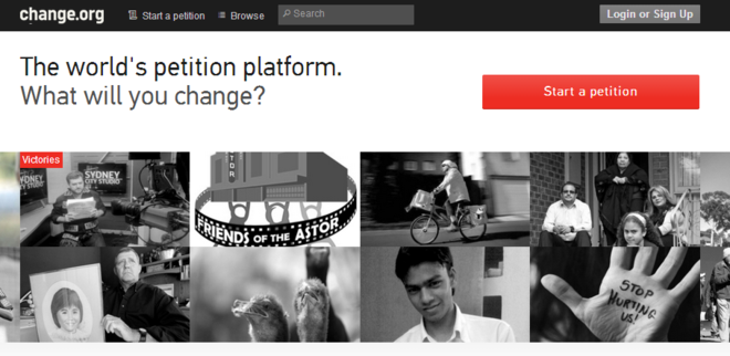
The Change.org button uses white space to draw attention.
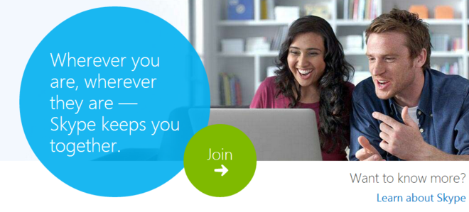
The Skype button uses contrasting colours and positioning to help it stand out from the rest of the page content.
Reducing The Steps
Reducing the number of steps users have to take can significantly help improve conversions. In some cases sites add forms to collect information as prominently as possible. Typically these:
- Provide clear benefits of taking the action or submitting information
- Ask only for information which is essential for the initial signup/conversion
- Explain how any information will be used and provide reassurance that the data is safe

The Obama election campaign website asks for as little information as possible and reinforces the idea that by entering your information, you’re part of something.
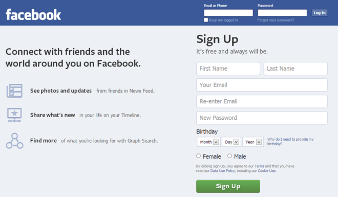
The Facebook homepage provides information about why they need certain data, and how they use it. This is accompanied by a break down of some of the main benefits of joining on the left.
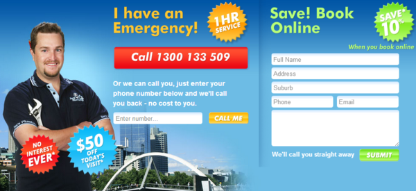
I had to include this example from Jims Plumbing. All the other examples are from some pretty big websites, so I wanted to show that this applies to smaller businesses as well. Personally I would try and simplify this one a bit, but I suspect it does a pretty good job. Definitely worth testing.
This example provides incentives to book online and makes it clear they’ll respond quickly. I hope to see more small businesses with landing pages like this soon.
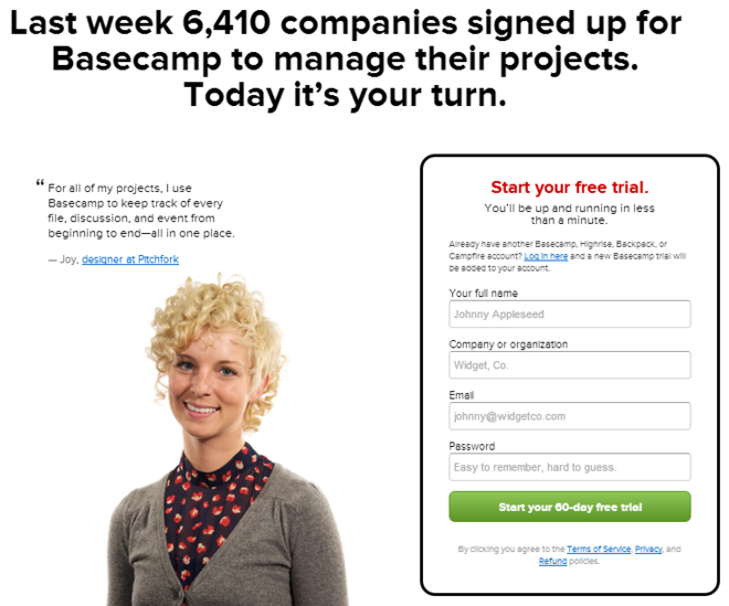
Basecamp provides plenty of reasons why you should signup, including social proof (“Last week 6,410 companies signed up”), a Free Trial incentive and requests minimal information. You can also review the all important ToS and refund policies before starting the trial.

This dating site also gets the information out of you fast. You’ll also notice that the woman’s line of site is directing your attention to the entry form.
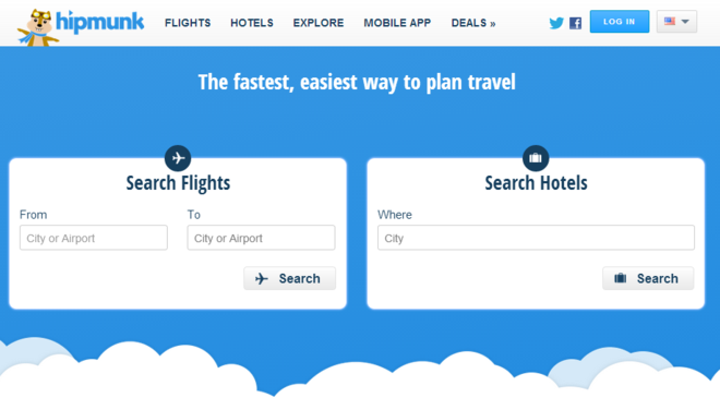
Hipmunk keep it simple with to very plain forms that take the users to exactly what they need right away.
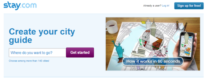
Stay.com also provide an instant user input, accompanied by a quick and easy video explaining how it all works. Not only that but the call to action stands out in the white space and the button gives a sense of moving forward.
Clear Benefits
Explaining what benefit the user will gain from taking the action is essential. Not providing a clear explanation is kind of like having a mystery box in a shop, where the user has to pay before they find out what they’ve got. And yes, taking an action is like paying money. Users are investing their time, energy and sometimes providing you with personal information. Ask yourself, why should someone complete the action and what are the benefits they are looking for by being on my site?
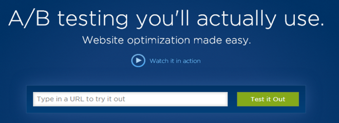
Unbounce make it pretty clear why you should signup. They make website testing easy. There’s even a video if you’re not sure, and you can test it out quickly and easily without any obsticals.
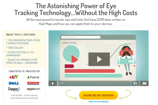
Visually, I don’t like Crazy Eggs call to action. But they do provide clear benefits with the text at the top explaining the product, then a video, accompanied by trust signals and links to more information, just in case you aren’t already convinced. Notably, the button itself uses a consistent “Show Me My Heatmap” throughout the site.
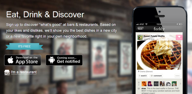
Forkly explains the App, what you’ll get out of it and where you can get it.
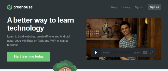
Again, a landing page which clearly explains in the text and provides a nearby video to convince you further. The call to action “Start Learning Today” also tells you what you’re going to get out of it.
Just Do It
A good call to action is not the reserve of large multinational businesses. In my opinion, all websites should have a strong call to action. It’s all well and good ranking #1 for Purple Widgets, but if your users aren’t sure how to proceed, they’re less likely to contact you.
Moar…
We want more. This is just a smattering of the examples I found. If you have some suggestions submit them in the comments below and if they look good I’ll include them. I’d really like to develop this further, so if you think there is anything I’ve missed, or your not sure about something, let me know.
Dan Petrovic, the managing director of DEJAN, is Australia’s best-known name in the field of search engine optimisation. Dan is a web author, innovator and a highly regarded search industry event speaker.
ORCID iD: https://orcid.org/0000-0002-6886-3211

Simply love the top 3. They are standing out from their surrounding. Dropbox black and white drawing and than blue button really works.
Got few ideas from this post and shared here too – https://www.facebook.com/Submissionworkcom/posts/563366743711557
Thanks for sharing.
decent collection!
This kind of awesome post is worth sharing Chris …
Instead of giving your home page you should share the direct link where this article is going to reproduce (I do believe that reproduce of any other’s post is not a good idea)
This is what I got after visiting your given link –
“Get A Trip is currently under construction. Please check back with us. Thank you for your patience.”
Nice Collection but you forget your own site. Don’t you like the call to action on your home page dejanmarketing.com. Because I love it and it is the best one 😀
Wow Chris, a thumbs down for the Crazy Egg call to action! Anyway, great post and thanks for spending the time to put this together. Have a good one.
Help! I need a unique call to action slogan for a real estate direct mail marketing campaign. Ideas, comments, or cuss words?
If an article is exceptional, as this one is, there shouldn’t have been any question as to why we would re-share it. And if you understood SEO, you’d understand that all links lead back here, effectively building backlinks into this original article, here on this URL, thereby creating this article to be seen by more people. That is a good thing for this article and its author.
Hi Lalit Burma…it would figure the one time anyone ever clicks links on a comment link, and we had to be down;) The truth is, we had an unexpected death in the family, a very young teenage girl. We all took it so hard we put the project and our professional lives on hold for awhile. We are just now regrouping with things.