What types of things frustrate you when shopping online?
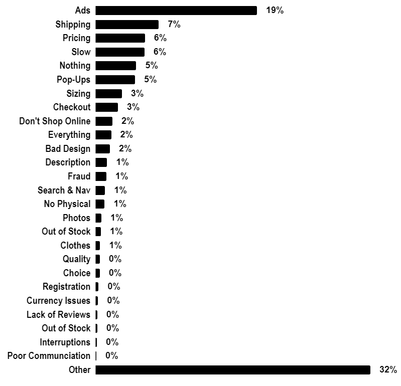
Among the top nuisance factors in online retail are various interruptions such as advertising or pop-ups followed by shipping, pricing and website speed. Additional findings surfaced in this study offer insight into less talked-about issues. For example, we found that “shopping experience” starts before users land on the website. In this article we break down top frustrations by showing main observations, sample of responses and main takeaways.
Quick Summary
- Analysis Date: February 2020
- Country: Australia
- Sample: 2,000 Respondents
- Survey Type: Open-Ended

Analysis of Top 7 Online Shopping Frustrations
1. Advertising
Ads are by far the most commonly mentioned nuisance in the context of online shopping experience. All the other factors negatively impacting online shopping experience don’t even come close. This one comes as a surprise considering that most online retailers tend to focus on conversion once users land on their product pages – not more advertising. Luckily we conducted an open-ended survey and there’s qualitative data to look at.
Response Samples
I rarely shop online, but the most annoying thing is not being able to find what you want quickly, and having ads and other IRRELEVANT stuff get in the way
User from ACT
being bombarded with ads for a product I’ve looked at for days/weeks afterwards. If I had wanted to purchase the product I would have.
Female, 45-54, NSW
excessive, distracting advertisement
Male 55-64 WA
Ads I didn’t ask for staying in my feed for months
Female 45-54 NSW
Seeing ads for things i have already purchased and no longer need to see ads for.
Male 35-44 QLD
Being bombarded with offers for products i am not interested in
Male 65+ VIC
Takeaways
Our interpretation of the data available is as follows:
- Ads are good when they’re interesting, relevant, timely and unobtrusive.
- Ads are bad if they’re irrelevant, excessive, repetitive or disruptive.
- Online shopping experience is not limited to on-site activities. It begins off-site in user’s social feeds, search results and content.
- Online retailers should broaden their understanding of user experience to include external factors including branding activities, social interactions and content.
- Careful consideration must be given to re-marketing as it appears to irritate two types of users.
- First group is those who are not interested and will not be interested, or in other words wrongly targeted.
- The second group is those who have already purchased the product and expect advertising for it to cease.
- Ads that run for too long irritate users who are not interested in the products and services advertised.
2. Shipping
Shipping frustrations are complex and include several factors such as:
- Shipping Costs
- Having to pay them
- Too high
- Unclear
- Not knowing it until checkout
- Shipping Availability
- Unclear
- Unavailable for user’s location
- Not knowing it until checkout
- Shipping Duration
- Regular waiting
- Unexpected delays
- Item Not Arriving
- Wrong Item Arriving
Response Samples
Not being able to calculate postage until the payment stage
Male 45-54 VIC
Not getting what I paid for and having to chase it up
Male 45-54 WA
When the product does not arrive
Female 25-34 NSW-Ashfield
Post and packaging charges not being clear until too late
Female 45-54 NSW
not knowing cost of delivery until final page and, because of that cost, having to cancel the purchase as a total waste of time and effort.
Female 65+ SA
Postage costs being high to make up for discounted products and you don’t find that out till well into ordering
Male 55-64 QLD
Waiting
Female 45-54 VIC
Takeaways
- People hate waiting. Tackling instant gratification in the context of online shopping is a challenge.
- In addition to parcel tracking, helping customers plan their shopping so the goods arrive when needed might help soothe the “wait-ache”.
- No surprises please! Whether the item can be shipped to the customer and how much it will cost needs to be evident in the start of the shopping process, not at the checkout. The alternative is shopping cart abandonment.
- Avoid tricks. Discounting product price and inflating shipping costs to compensate might trick a few customers, but it won’t build loyalty.
- Work with reliable couriers with low rate of misplaced and lost packages.
3. Pricing
Most people want quality product and cheap prices, which is neither news nor helpful. That said there are other price-related insights gained from our research.
Response Samples
Prices not given in my currency
Male 55-64 NSW
when websites don’t show the price and you have to request a quote
Male 25-34 NSW
No prices without registering
Male 45-54 WA
misrepresentation of prices – not including taxes and charges in the total advertised price
Unknown QLD
Takeaways
- Show prices straight away, not after login or quote request.
- Show prices in the correct currency.
- If possible, ensure that the price is inclusive of taxes, shipping handling and any other charges.
4. Slow
“Slow” means a lot of different things to users. It could be slow internet connection, device or a website. But it could also imply a payment gateway lag or even overly complex user experience. Amazingly, it could also mean a slow user facing an expired session.
Response Samples
When something lags especially during payment
Male 35-44 SA
When there is a internet problem and I can’t get any further
Female 25-34 VIC
pages slow to load, complicated websites without easy to follow navigation
Female 65+ WA
Hard website to navigate to purchase – taking too long
Male 35-44 VIC
Slow payment gateways, having to wait for the payment to complete
Male 55-64 NSW
When the website times me out before I have made a decision and completed my purchase.
Male 65+ NSW
Takeaways
- Have a fast and simple to use website.
- Consider switching to “light” website mode for users with slow connection.
- Allow customers to resume their shopping experience past the expired session or broken connection. Be helpful and give them something more than just an empty shopping cart.
- Process payment as a background process while user is taken to the next step of their shopping experience.
5. Pop-Ups
This item may seem like it should belong in “Advertising”, but after careful consideration we classified it separately. A term “pop-up” describes more than just advertising, it’s a synonym for on-screen interruptions.
Response Samples
Pop up offers of help only seconds into viewing
Unknown QLD
Pop ups and talking bots
Male 25-34 VIC
Pop ups subscription demands
Unknown WA
Takeaways
- Avoid multiple pop-ups on the same page, or pop-ups in combination with other interruptions (e.g. newsletter subscription).
- Don’t be too quick to pop-up your chatbot, consider applying a delay or choosing the best moment to activate.
6. Sizing
Sizing and product dimensions are on obvious issue. As a bare minimum customers expect to find the size / dimensions. They expect them to be relevant to their country and they expect the delivered goods to match the described size. It takes effort to return goods that don’t fit, and the amount of effort along every step of the way directly impacts user experience.
Response Samples
When they don’t have my size!!
Unknown SA
Not knowing the size of a product
Male 18-24 WA
Sizes not easily found
Male 55-64 QLD
Sizes not matching reality
Female 55-64 NSW
different overseas sizing
Male 65+ QLD
Having to return items that do not fit
Female 25-34 NSW-Ashfield
Takeaways
- Ensure product descriptions contain easy-to-find dimensions and sizes
- Use sizes and standards that match customer location (or at least offer a calculator / converter)
- Offer a wide range of size options
7. Checkout
Users prefer straightforward checkouts with no surprises. They also hate to enter credit card details and like to have their favourite payment method included.
Response Samples
Not being able to find the check out after I’ve added things to my basket
Unknown VIC
entering credit card details
Male 45-54 VIC
(1) slow web response and (2) add-on items, which need to be un-selected before checkout, otherwise you end up buying them!!
Male 65+ NSW
Too many details to complete
Female 45-54 NSW
Additional charges not included until checkout
Male 45-54 TAS
Concealed charges added at the end of purchase
Female 35-44 NSW
Requirement to have a credit card.
Unknown NSW
Calling for quotes, no afterpay option, poor quality search
Female 25-34 VIC
When Payment Confirmation and Order Confirmation is not given after making the payment
Female 35-44 VIC
inability to guest checkout
Female 45-54 WA
Takeaways
- Disclose available payment options as early as possible, ideally on the product page.
- Offer alternative to credit card. Ensure your customer favourites are there (e.g. PayPal, AfterPay…etc).
- Enable guest checkout.
- Thank you page should be obvious and reassuring.
- Calculate or estimate shipping up-front, avoid adding surprise charges at the checkout level.
- No tricks! If adding upsell items, ensure they’re not already ticked or added to the cart without explicit user action.
- Don’t ask your customers for too many unnecessary details. People don’t like to type.
When it comes to nailing your eCommerce game, it’s not just about removing these barriers or shopper frustrations, it’s also about leveraging the latest trends to improve customer experience or CX.
Dan Petrovic, the managing director of DEJAN, is Australia’s best-known name in the field of search engine optimisation. Dan is a web author, innovator and a highly regarded search industry event speaker.
ORCID iD: https://orcid.org/0000-0002-6886-3211


